Glamourous Life

Glamourous Life

by Myesha Hill
(Long Beach, Ca.)
Glamourous Life

Glamourous Life

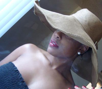
My name is Myesha and I'm a photo newbie who became passionately involved with photography about a year ago. This photo was taken in my livingroom around 4pm. I used only natural light and a fill card to acheive my lighting. This was my first time playing around with ISO speeds and I believe this ISO was around 400. The camera is dutched which I became famous for in almost all of my photos in photography class. My model is a very good friend of mine's who worked endlessly with me that day to create the look that I wanted. I had her stand still so long that I owe her a pedicure and drinks. LOL!! I had the vision for this photo as I was driving home on the freeway, and called her. She was supportive of the idea....and henceforth the Glamourous Life.

Comments for Glamourous Life

Average Rating starstarstarstar

Click here to add your own comments

Rating
starstarstarstarstar
Response
by: Myesha

The photo assignment was for natural light. We had to use window light for our photo in class. She was smoking a cigarette, but for the size requirements of this competition I had to crop significantly.

Rating
starstarstarstarstar
Photography
by: Lalani B

Very good, Excellent lighting. Your model could not have done it without your instructions. Beautiful photography.

Rating
starstarstarstarstar
2 Thumbs Up
by: Omar

Nice job keep up the good work.

Rating
starstarstarstarstar
Loving It
by: Anonymous

Beautiful color.

Rating
starstarstar
smoke in the photo?
by: Anonymous

The photo is nice but it looks as if there is cigarette smoke in the photo going across the models face and even above her head.

Rating
starstarstar
Just okay
by: Anonymous

The pose is okay but it looks as if you took the photo through a window as you can see shadows/reflections in the photo. I would have liked to see more of eyes to add a bit more to the pose and less of an angle on the photo. All in all its just okay for me.

Rating
starstar
Needs improvement
by: Anonymous

The photo is okay but the color could be improved and there is something in the middle of the photo that seems to draw the eye away.

Click here to add your own comments

Join in and write your own page! It's easy to do. How? Simply click here to return to Photography Poses.


Best Camera Deals

David Coote
Wedding Photographer
Northern Ireland